


Framed: 63 1/4 x 73 1/2 inches
artist
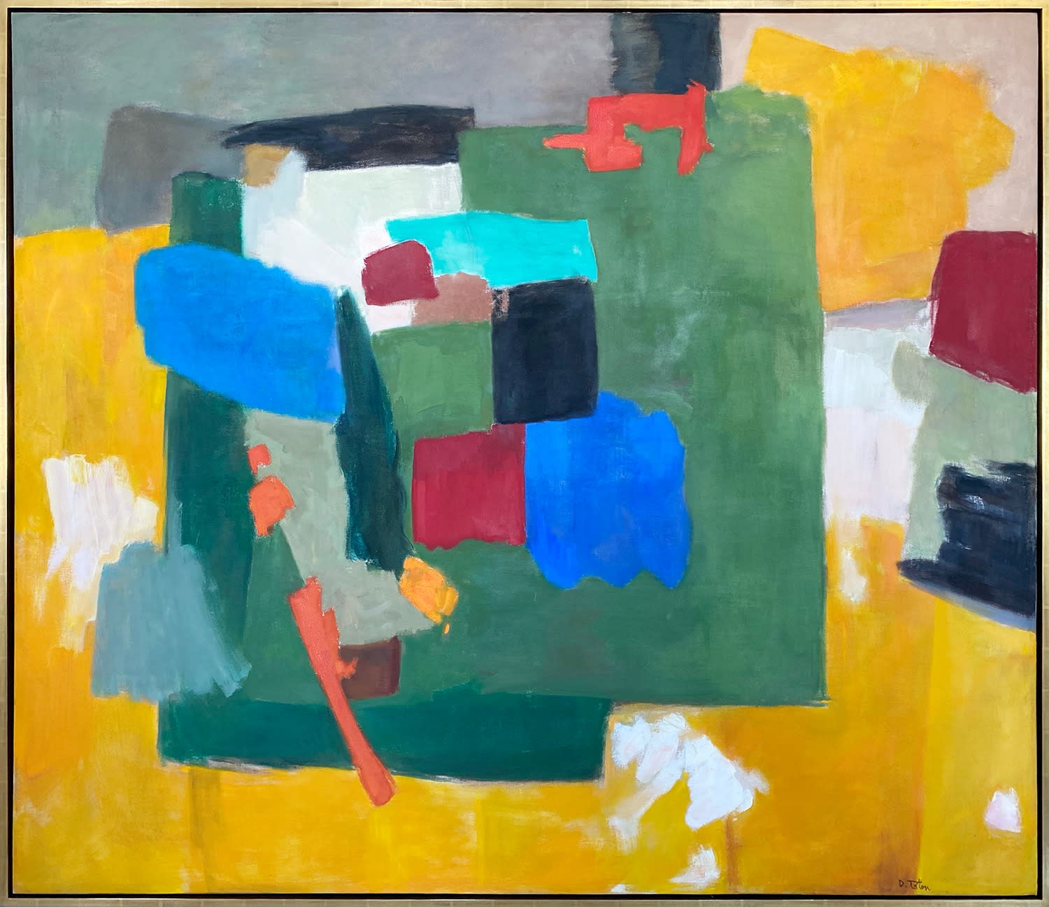
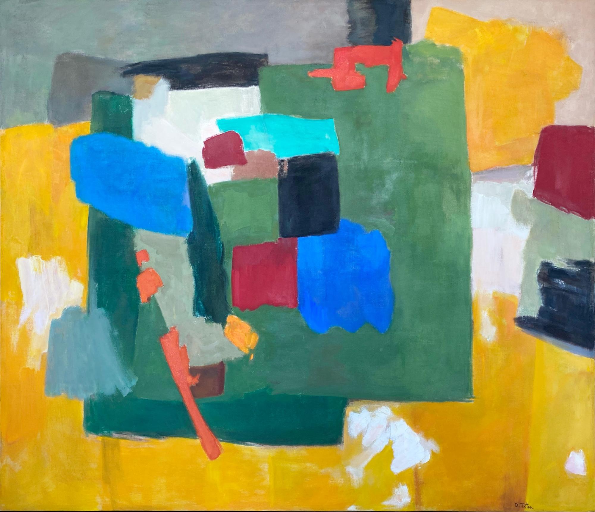
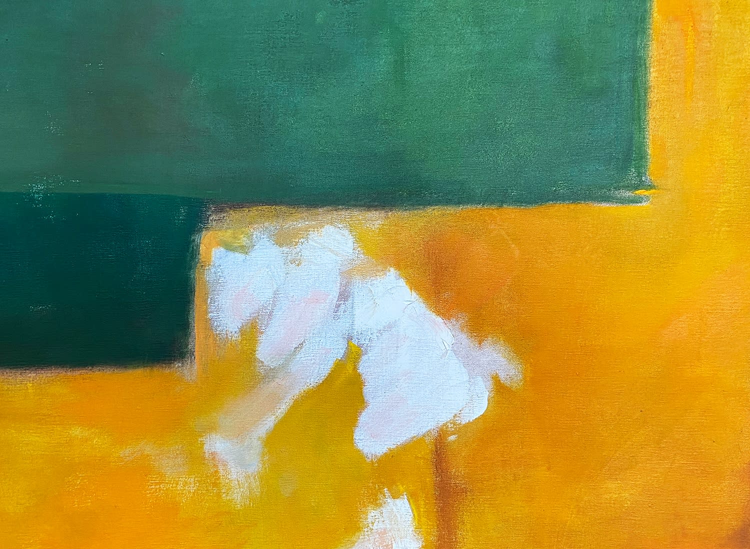
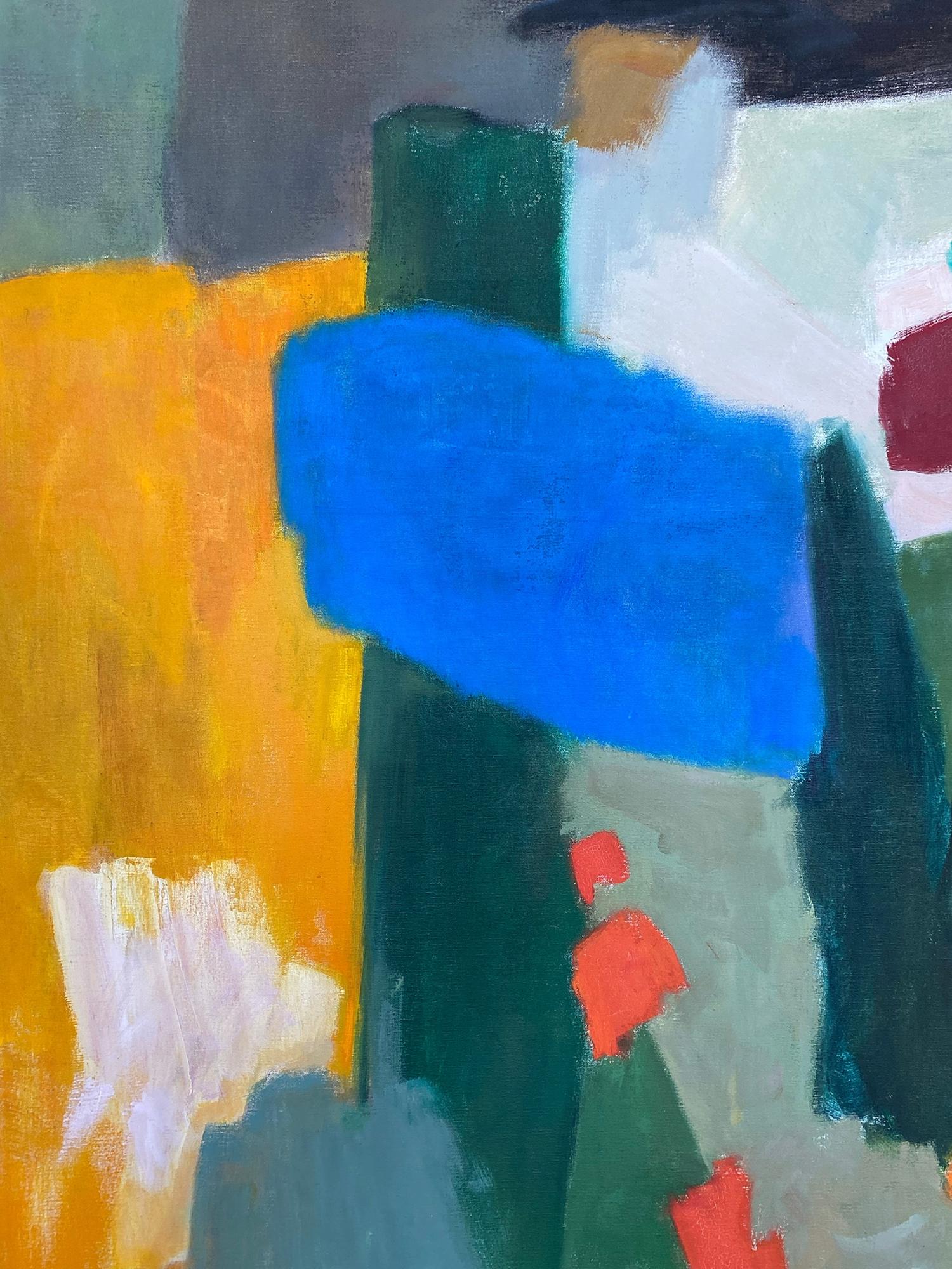
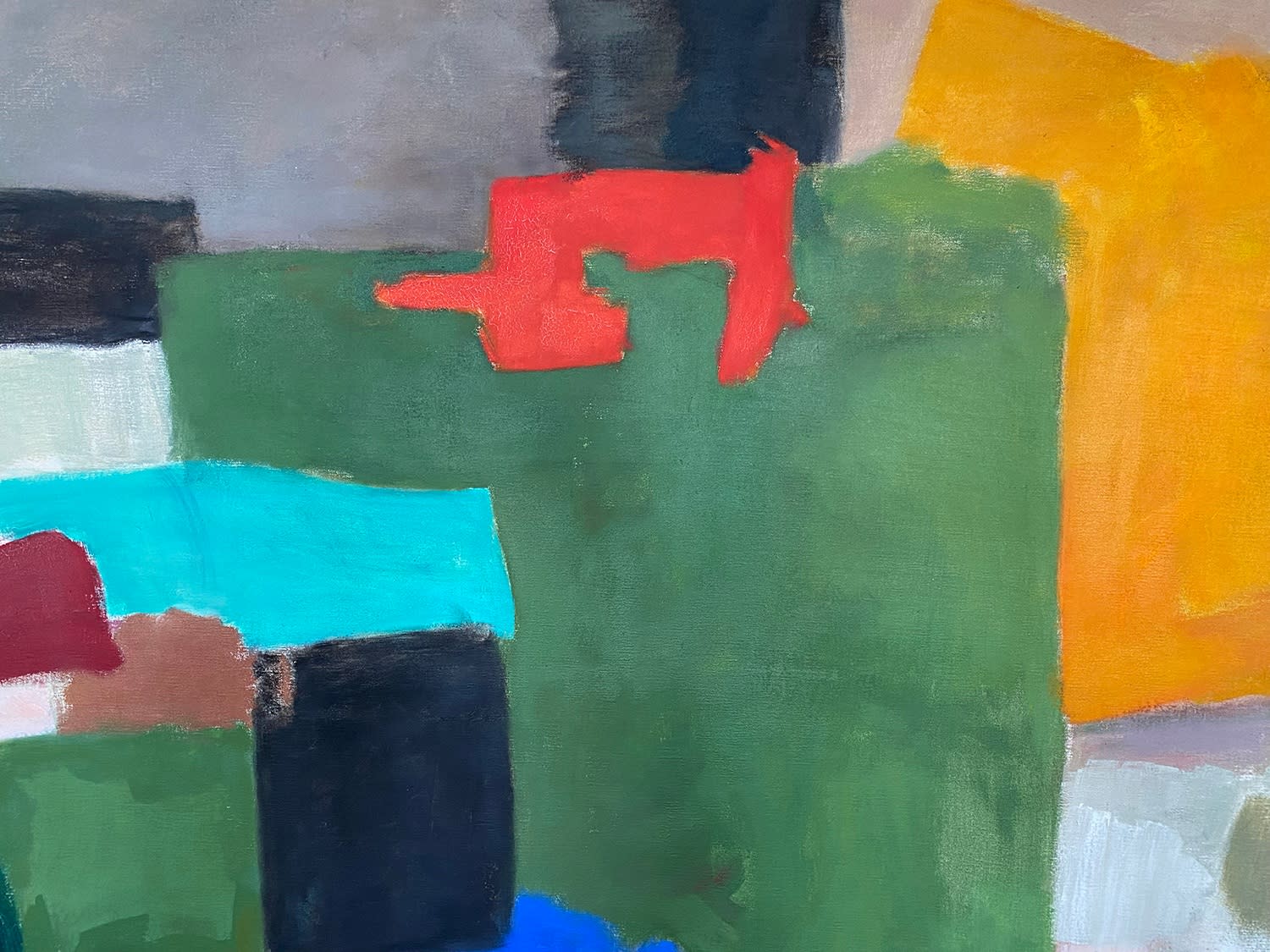
1961 marks a pivotal moment in Totten’s career, departing from the subdued desert-inspired color palette that had characterized his previous work to embrace a more flamboyant and adventurous aesthetic, embarking on a creative exploration that resonated with the buoyant spirit of the era. This marked shift coincided with Totten’s deepening engagement with Synchromism, a movement spearheaded by Stanton MacDonald-Wright, under whose tutelage Totten had studied. Drawing inspiration from MacDonald-Wright, Totten absorbed the foundational principles of Synchromism, yet he always approached them as a catalyst for his own distinctive artistic vision.
Totten’s artistic process appears deceptively effortless, mirroring the demeanor of the man behind the brush. Modest, soft-spoken, and gentle, Totten embodied humility in his approach to his craft. Yet, beneath this unassuming exterior lay a profound commitment to his artistry. Immersed in the act of painting, Totten dedicated himself wholeheartedly to his practice, infusing each canvas with a palpable sense of daring and conviction.
To liken Totten’s oeuvre to that of luminaries such as Clifford Still or Edward Dugmore may seem audacious at first glance, however, upon closer examination, one discerns a shared mastery of abstract expressionism and a profound depth of artistic expression. Totten stands shoulder to shoulder with these titans, his capacity to produce profound abstract works attesting to his enduring legacy as a visionary artist.
Description
Rather than starting from a particular model, these paintings are… “keyed” in relation to a particular experience, whether that experience be about landscape, mood, the seasons, a musical theme, improvisation, or anything else.”
Synchrony is an intriguing work from the 1960’s by Totten that has an interplay of space and interlocking forms. It almost conveys a sense of pieces that work together and are dependent upon each other but also have autonomy. The human eye takes in the different forms and shapes here and sees that each shape is dependent on the shape next to it. As the title suggests, Totten has all the forms on equal footing and no one area more important to another. And yet there are surprising color values used here such as the choice of the aqua blue and the browns and blacks which in theory might be too harsh for the other colors. The composition is warm, almost sun drenched and verdant in its use of greens. All of Totten’s work has a feeling that it is in deference to nature.
And a great word the Totten uses at one time is that of “improvisation.’’ With a work like this the viewer feels the artist could have taken a walk outside, seen certain foliage and light and color or listened to a particular piece of music and worked from that point to create a composition such as this one. Then as he is working, the word improvisation is important as he starts to solve the formal aspects of making it come alive and work and he goes with flow of what he feels. In the end, his compositions are satisfying, and the viewer feels he has arrived at a GOOD place and that is what makes his work appealing.
provenance
exhibitions
Donald Totten: Recent Paintings, Santa Barbara Museum of Art, Santa Barbara, CA, June 9-July 12, 1964.